The Customize button inside an offer or upsell editor does not open a per-offer popup. It deep-links to this page, already on the surface that styles that item.
How the page works
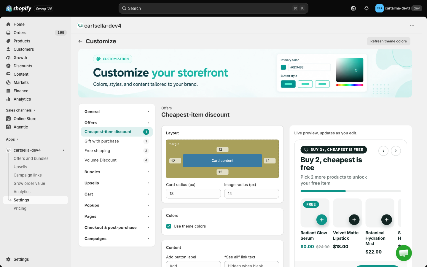
The page has three columns:- The surface rail on the left. One entry per stylable surface, grouped by where it appears.
- The controls in the middle. Colours, texts and layout numbers for the selected surface.
- The live preview on the right.
Surfaces
General
Offers (product page)
Product page card styling is per offer type, so a gift with purchase and a volume discount can look different if you want them to.
Each type starts from a shared base style. The first time you edit one, it is seeded from that base, then it goes its own way. If you never touch a type, it keeps following the base, so existing stores see no change.
Bundles
- Standard Bundle
- Build your bundle (app block)
Upsells
- You may also like. The full template editor for the product page upsell: layout, colours, texts, card style, cards per device.
Cart
- Cart upsell. The card layout and styling for the cart cross-sell.
- Cart progress bar. Fill, track, text, success background and success text colours, plus the progress headline and success message. The milestones themselves live on the Progress bar page.
The cart upsell splits its settings. The card look is global here. The headline, max products, which surfaces it shows on, and its button colours live on the upsell itself, because those are content rather than style.
Popups
- Spotlight popup. The offers hub bubble and popup: bubble, popup background, popup text, accent, card background and border colours. The rest of the hub, including its content mode, badge, pages and countdown, is configured on the Offers hub page.
Pages
Checkout and post-purchase
- Thank you upsell. Style only. The template and its texts stay on the upsell.
Campaigns
- Campaign loader. The loading page shoppers briefly see when they open a campaign link: accent, text, muted text, card background, button text, plus the loading title, message and a logo URL.
Use theme colours, or your own
Most surfaces start with Use theme colors turned on, which means CartSella inherits your store’s palette and the widgets read as native. Turn it off to expose the colour pickers. Text settings like a headline or a button label always apply, no matter which colour mode you are in.What is not on this page
Some things are styled where they are configured, because they have their own setup page with a preview:Translations
CartSella auto-translates the storefront text on your offers and announcement bars into your store’s other languages when you save. Only changed text is re-translated, so saving twice costs you nothing. See Languages and translations for exactly what is and is not covered.Tips
- Prefer Use theme colors where it is offered. Widgets that match the theme feel like part of the store rather than an app bolted onto it.
- Check the preview on a narrow window. Most shoppers are on a phone.
- Save before you navigate away. The page warns you about unsaved changes, but it is easy to click through.